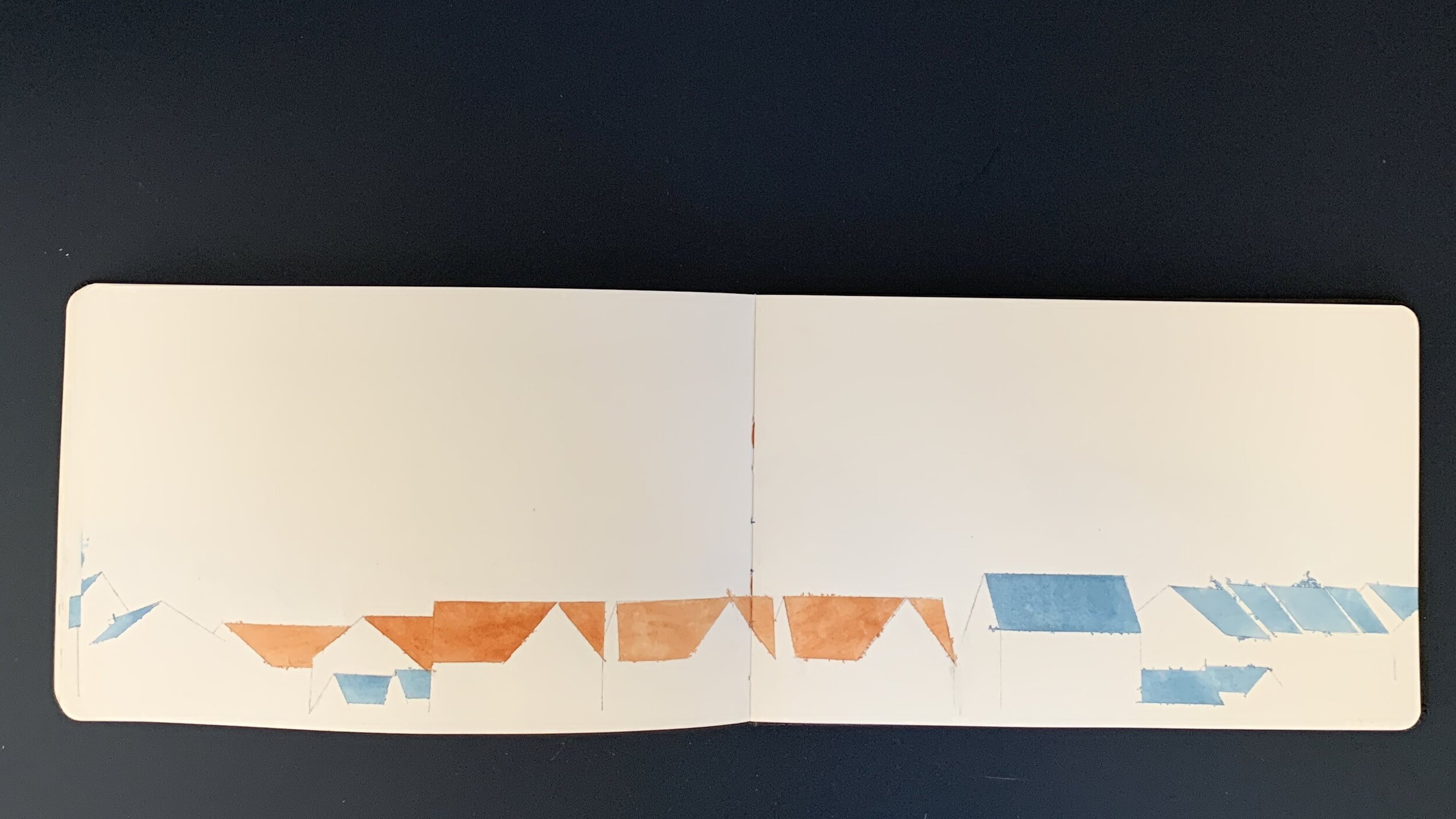
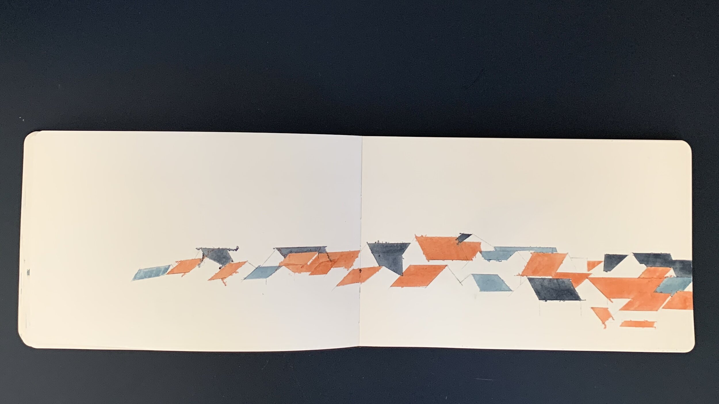
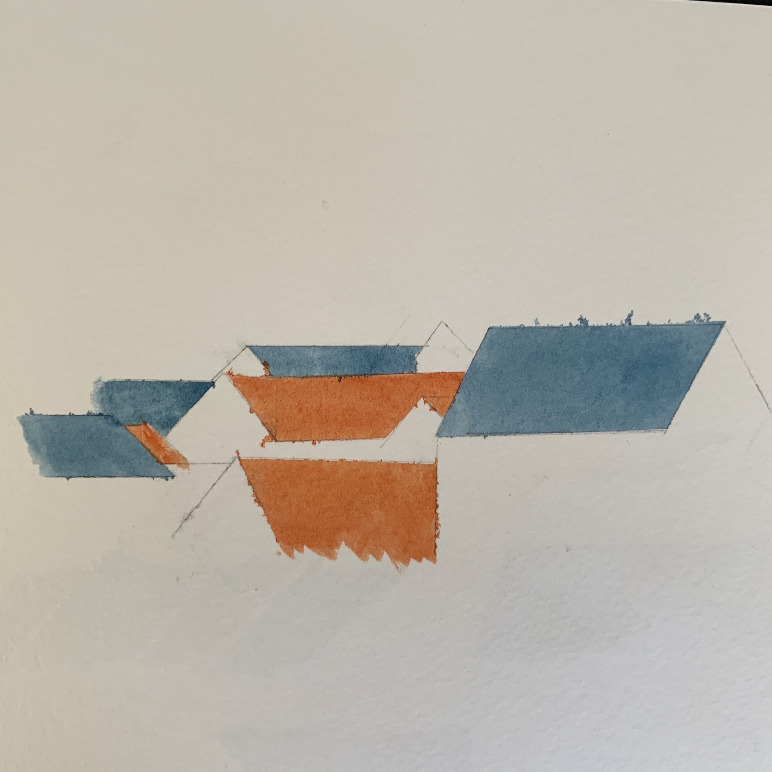
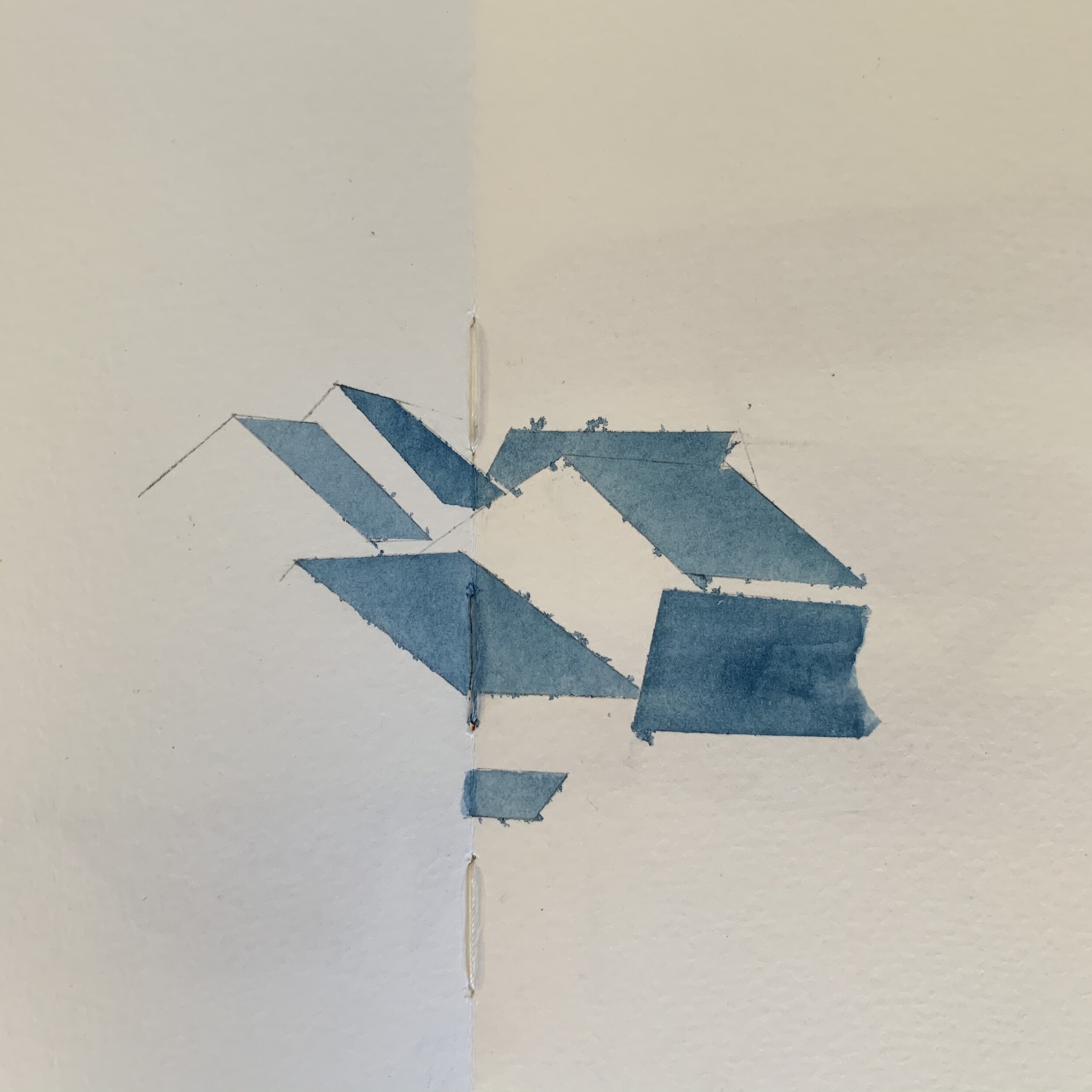
Roof top Studies
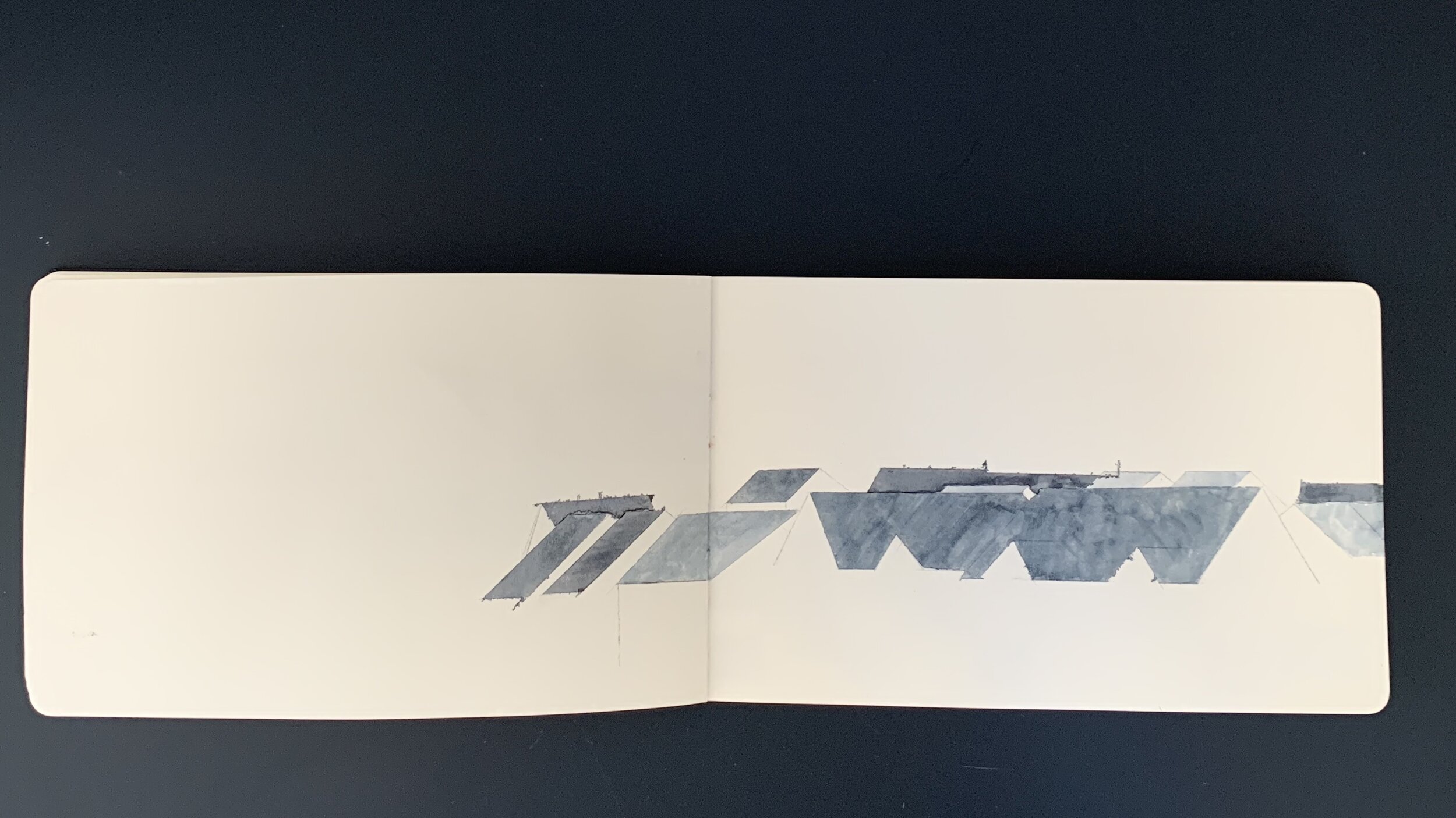
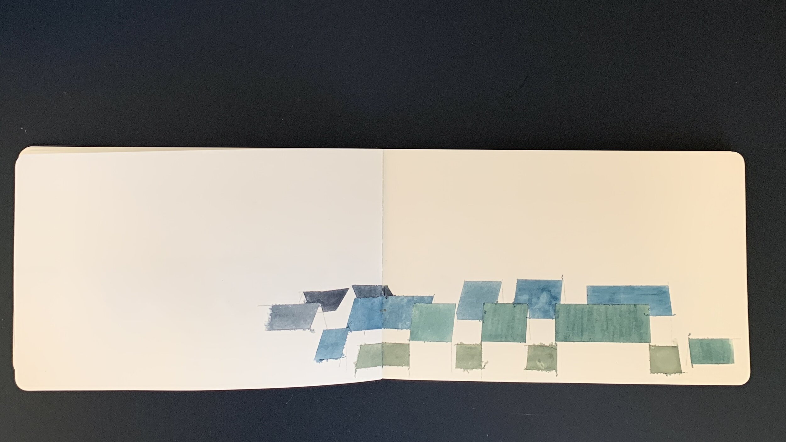
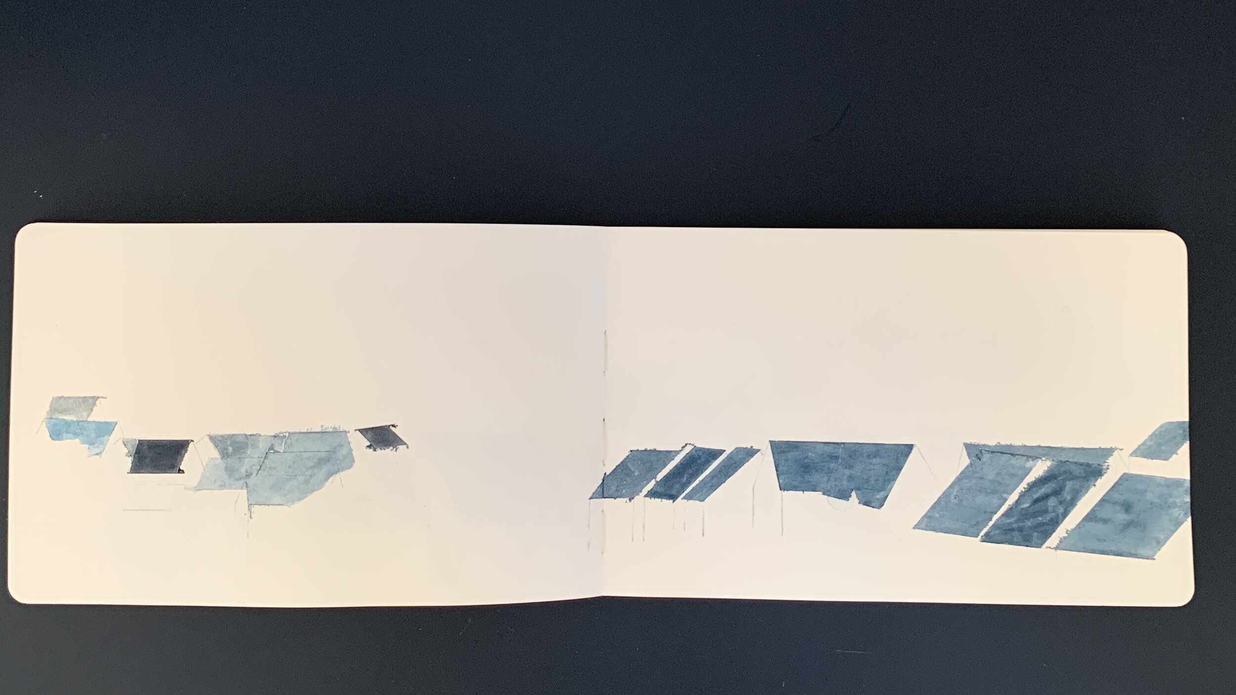
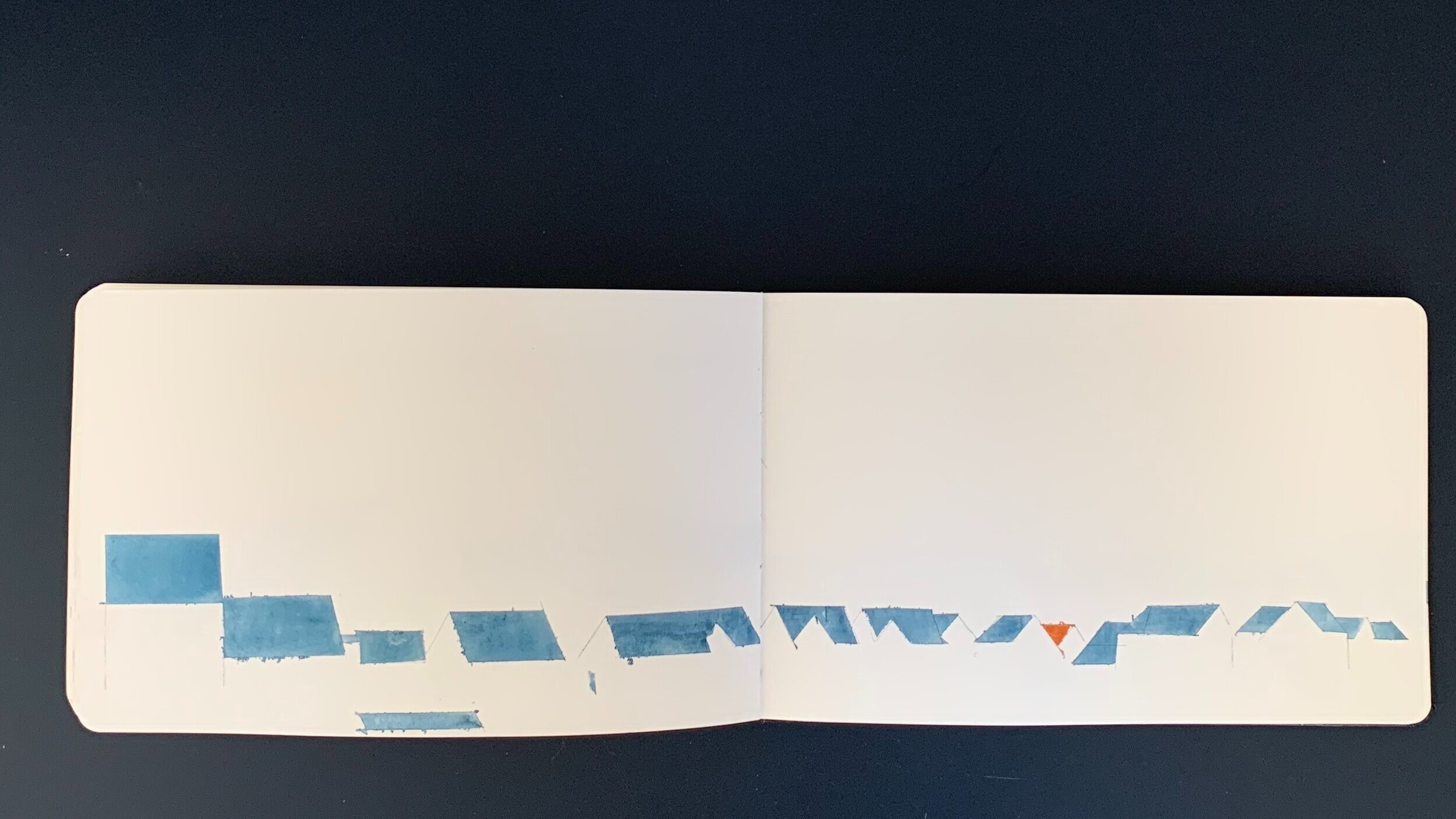
During lockdown I decided to begin painting with a watercolour set. Having never really painted before this was a totally new avenue for my practice. The water colour set was the only thing in the house that could apply colour to paper & while yearning to screen print I knew that I wanted to create images with colour. Like all artists there is a stack of unused sketchbooks & journals in the house. So, take one unused Moleskine, one watercolour set & an ongoing fascination with the roof tops against the skyline around the local area & a new project is born.
After buying a copy of ‘Ed Ruscha, Course of Empire’ just before lockdown, where the themes of architectural paintings, buildings against a background of sky & revisiting the same places are explored, these ideas were fresh & contextualised in my mind. So, while on lockdown walks around the country park that is intwined with the town where I live, I began to take lots of photos of the roof tops over the hedges. This progressed into studying the town from the outskirts, again focusing on the silhouette of the line of roof tops against the sky behind. Admittedly this subject can seem a tad static, repetitive or dull, but never the less a good reflection of the experience of lockdown. The roof top tiles are still new on the estate & un-weathered. In some instances they reflect light from the beaming sun far more than you would expect. At other times they seem to be catching shadows in odd ways due to the mix of jaunty angles from the warrens of streets. There is a mixture of terrace housing, small apartment blocks, semi & detached homes, coach houses, garages & annex buildings, all with pitched roofs in slate grey or terracotta tiles. The edges of the estate follow the curving form of the green spaces. This detail dictates the flow of the roof lines which, from the fields meander over the hedge rows along the road into the distance. On paper this translates as various geometric forms facing in different directions, sometimes sprawling in a line across the page & sometimes in a cluster at the edge.
At the outset I thought these water colours needed to be ‘perfect’ in terms of crispness & uniformity of colour application, which I initially tried to do. However as the sketch book went on, the sun during lockdown got hotter into May & I cared less about being perfect while applying colour. It turns out water colours don’t lend themselves too well to this technique, although a certain degree of preparation will give straight lines that are mostly crisp. Over time it was clear that giving in to the small amounts of colour bleeding under the tape that sectioned each part, was both beneficial to my patience & the final feel of the sketch. For me these small bleeds convey the feel of the heat mirages on the baking rooftops. It perhaps also shows that I’m new to watercolour painting & am less precious than normal about getting the best result every time.