Exeter Contemporary Open 2022
Exeter Phoenix is back with its annual contemporary open exhibition
& as usual it is filled with a variety of contemporary art that should please every art lover. It would seem that this exhibition call out is ever more popular nationally, often tempting in artists from far & wide. This I believe is testament to the gallery & its ambition when showing contemporary art.
As usual I have picked out a few of my personal highlights from the exhibition but as always you must see a show to get the full experience.
Looking at my camera roll there is only a small selection of the exhibition work. There were a few more works that I could have talked about, however in the gallery I was clearly in the moment & didn’t take any photos of them.
Painting
A process that has grown on me over the last few years, painting is often towards the top of the list of things I look forward to at exhibitions. The scale, abstraction & colour are the elements that jump out with the paintings I’ve looked at here.
Lottie Stodart’s painting, Monster Munch at a base level uses a great pallet of colour & creates an interesting shallow depth. Made almost entirely in shades of green that sit forward of & frame a pink section in the centre. This pink shape, emphasised with black cartoonish lines is the only vertical shape in the composition. The rest, in green takes horizontal forms, suggesting a landscape. This painting seems to emulate a diorama, the shallow depth is emphasised with a subtle frame painted within the canvas with which everything is contained. The very back layer of the painting is striped, adding an effect of cardboard corrugation, further pushing the illusion of a diorama.
In the gallery this painting is paired with another of Stoddart’s work, which is a 3D piece made in cardboard (the caption says mixed media) & resembles a physical representation of the painting. For me the painting is the star, but having both brings forward the process of the artist and allows the work to exist in context of a practice. The larger body of work can perhaps be understood better, adding an extra dimension to the quality of the exhibition.


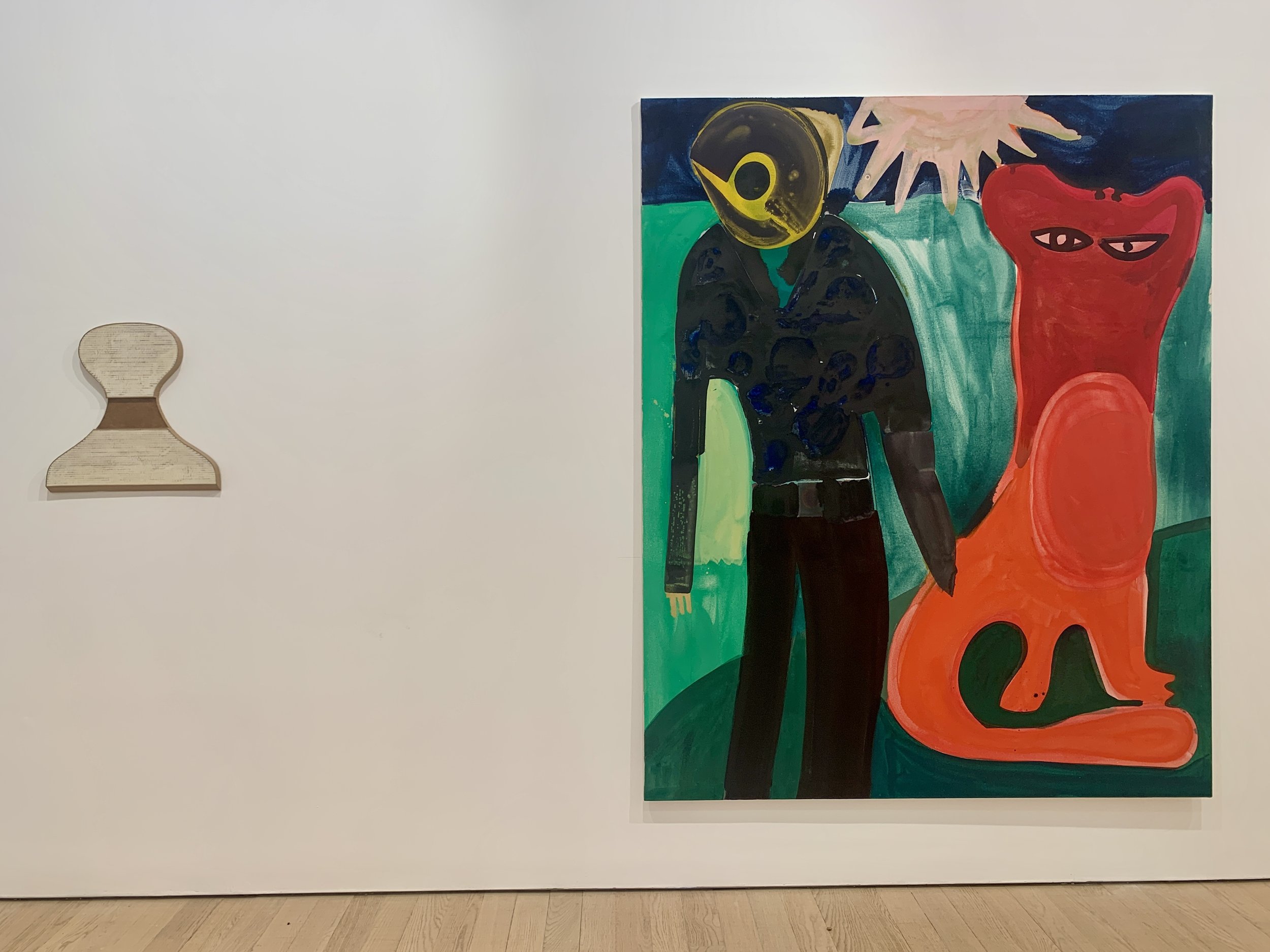
In the 2 paintings by Alex Crocker, Red Cat & Laura & Dog (Dunes) I am excited about the scale of both paintings & the forms on the canvas. Also, the colours & visible gestures along with the painterly quality jump out as exciting in this work.
The images are bold. At a glance this is the primary quality, but when you spend time infront of these paintings you begin to see more. Due to the scale of the canvases you begin to understand the bodily gestures of the artist as the paint is applied. Some of the marks are made in fluid movements, showing a freedom in the process. Particularly in Red Cat where it is possible to see a range of physical energies in the application of colour. See for instance the longer fluid lines that make the belly & tail of the cat versus the shorter, choppier green patch between the cat & the human figure. The contrasting applications help to build a picture of Crocker making decisions & working on the canvas.
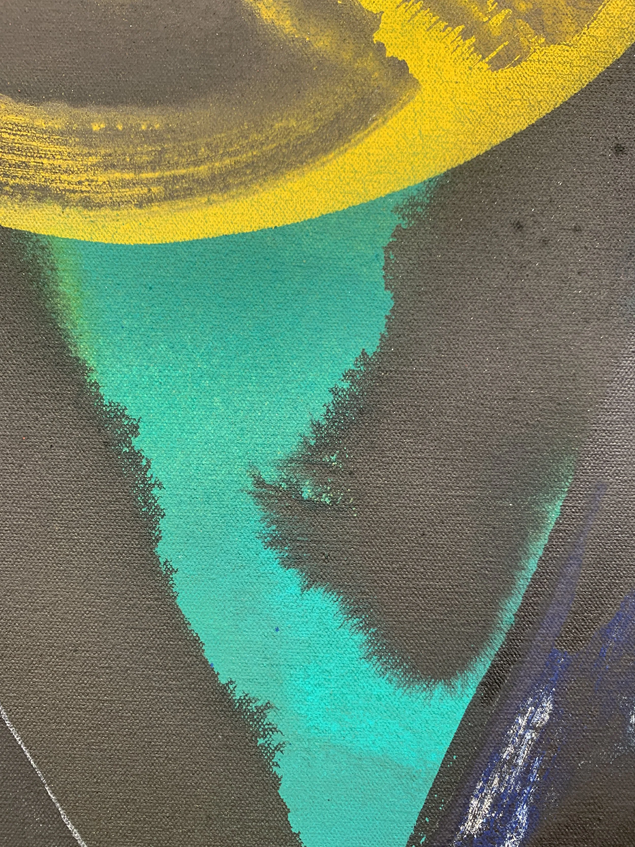
Where it’s possible to see the human input in these paintings there are also moments where the material properties take focus. In the detailed image of Red Cat there is an instance where the black paint of the jacket bleeds into the green of the under shirt. In contrast to the gestural moments elsewhere on the canvas this detail is less determined. The fluidity of the paint has made the form & we are now aware of time scale in this work.
Although both paintings are bold & graphic, it is only Laura & Dog (Dunes) that takes on the cartoon like black outlines. There is also more of the liquid paint bleeding in this painting, particularly seen on the horizon of the painting & in the dogs fur. It also extends to the washy texture in the skin & grass. The reason this is interesting may be due to 2 other details in this work.
1, there are visible pencil lines from the initial sketching of the painting. A detail that once again highlights the process, but also shows how change occurs in the work. Some of the pencil lines do not correlate with the painted lines. This perhaps shows how the image evolved as colour was applied. The pencil lines are also very gestural, similar to the other painting where its easy to imagine the bodily movement it takes to fill a canvas of this size.
2, im not sure why, but thinking about the fluidity & washy textures of the the painting as a whole makes the bottom left section really interesting. This green section is entirely even with solid colour throughout. The island of colour is bordered only by the edge of the canvas & the thick black line that describes the edge of the human body. The separation & difference in application throw in one further detail, allowing this part to be the most clarified part of the painting. It becomes quite satisfying & provides a measure in the work for all of the edge qualities.
Object / Sculpture
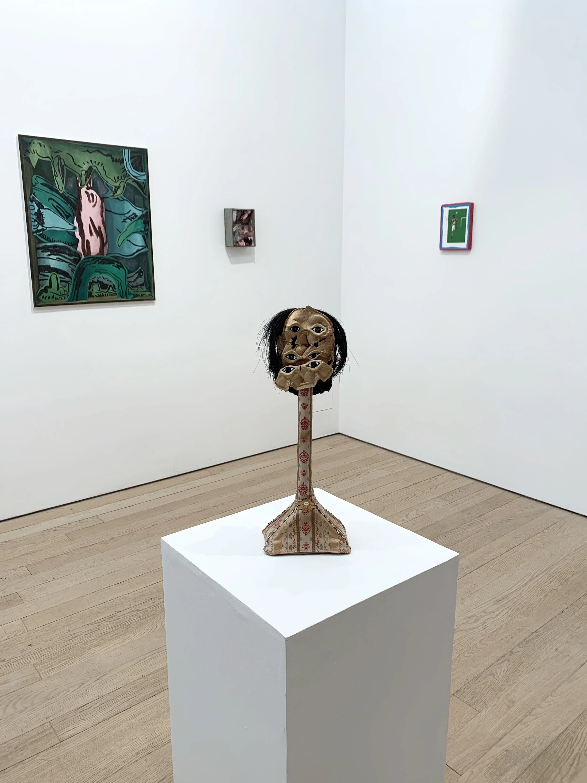
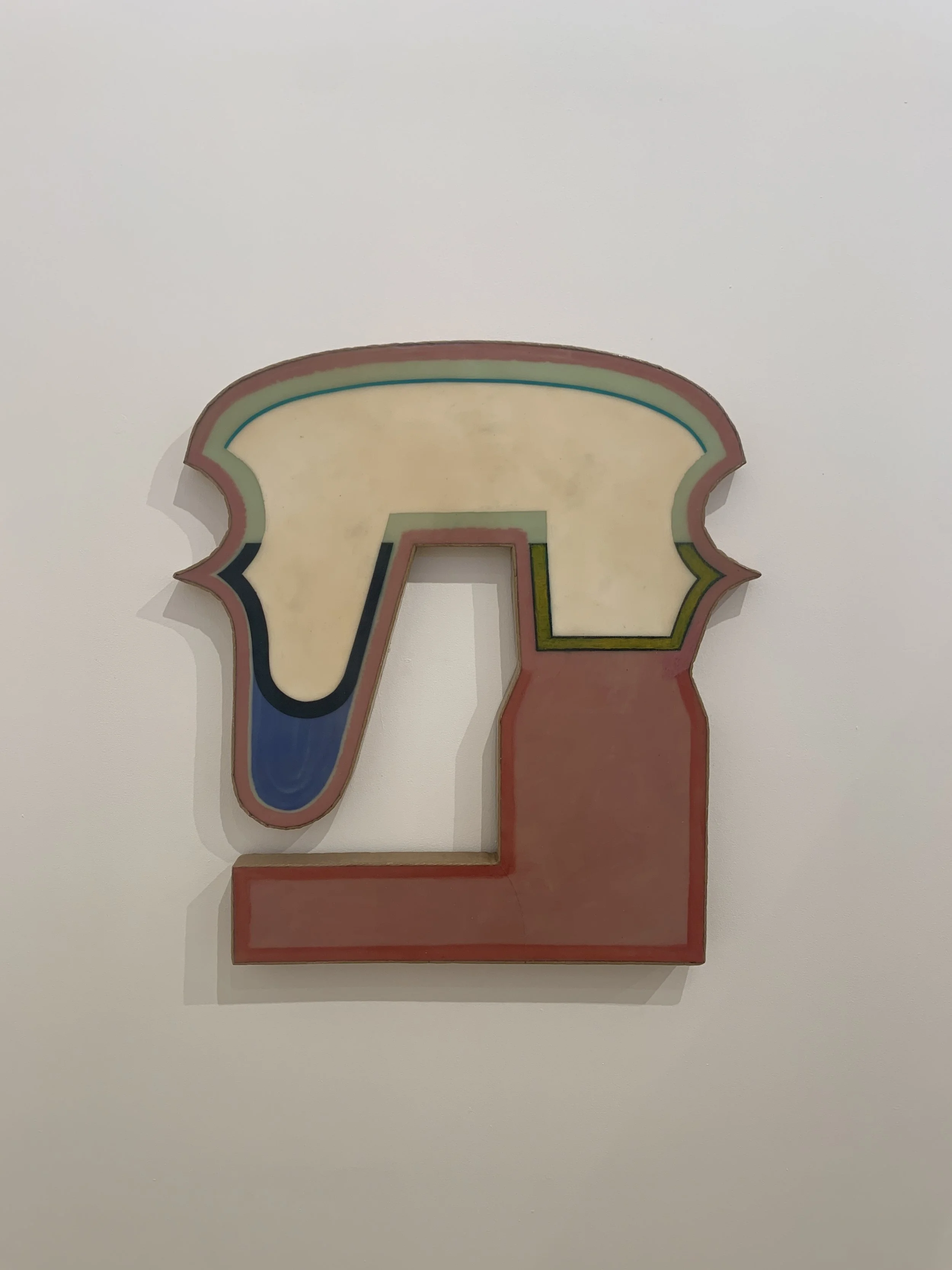
Jackson Sprague is on form with these works. Everything is right from the size & colour, to texture & shape. It might not even be that easy to write about these, they’re one of those art works that you just love.
The detailing in (head) where it is possible to see the corrugation of the cardboard is interesting. There is a honesty to the material & the effect is something that if you work with cardboard you have to embrace. Not only is it embraced here its exploited. When comparing the face of each work, there are stark differences. One, as mentioned is raw in appearance & shows its materiality, the other is highly composed & the resin leaves the surface looking super smooth & glossy. On the edges both show the bend & folds of cardboard. The rim of cardboard surrounds the whole object, containing it almost like the edges of a pool where the resin has been allowed to set.
These works comprise equal part sculpture, object & painting. Although they seem familiar the shapes aren’t exactly representational, yet they do allow the materials to act in several ways adding dimensions that make the work exciting.


Other Details
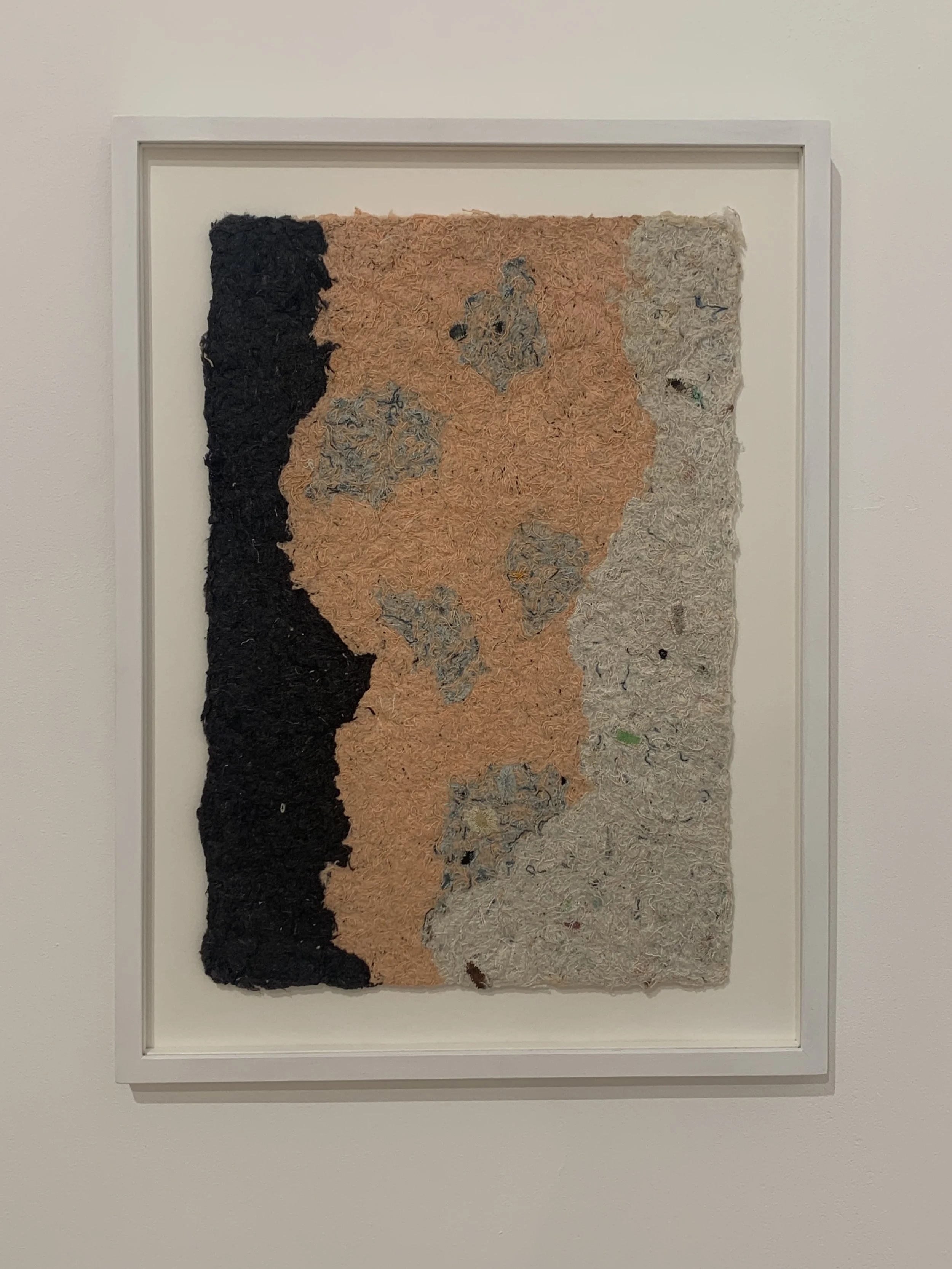
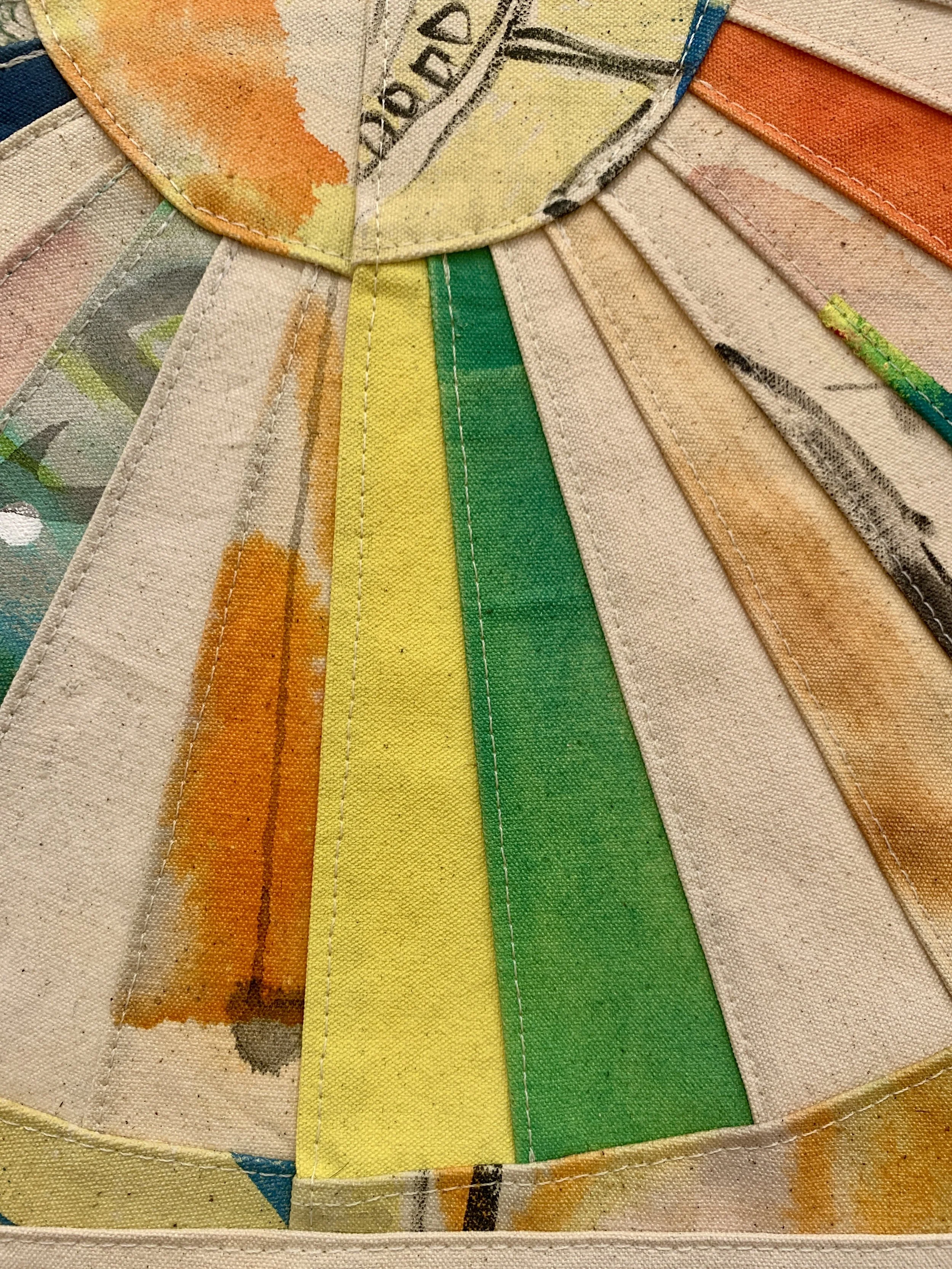
Finer details in other works are also worth noting. The hand made paper rag by Ben Sanderson is really satisfying & raises questions about value, process & artist materials. The paper rag is described as being made of waste material from old canvases. A former surface made a new, but rather than into paper to be drawn or painted on, the paper itself is the focus. The artist material has become the framed work. This same value comes into Sanderson’s tapestry which is a patch work of old canvases reworked into a hanging piece. The up close details are once again really satisfying & are worth exploring. Moments of colour & design come together, neatly distilling many works in one.
The processes that have come before make the new work. With Ben’s pieces which are built over time, the audience is exposed to how a practice might evolve.
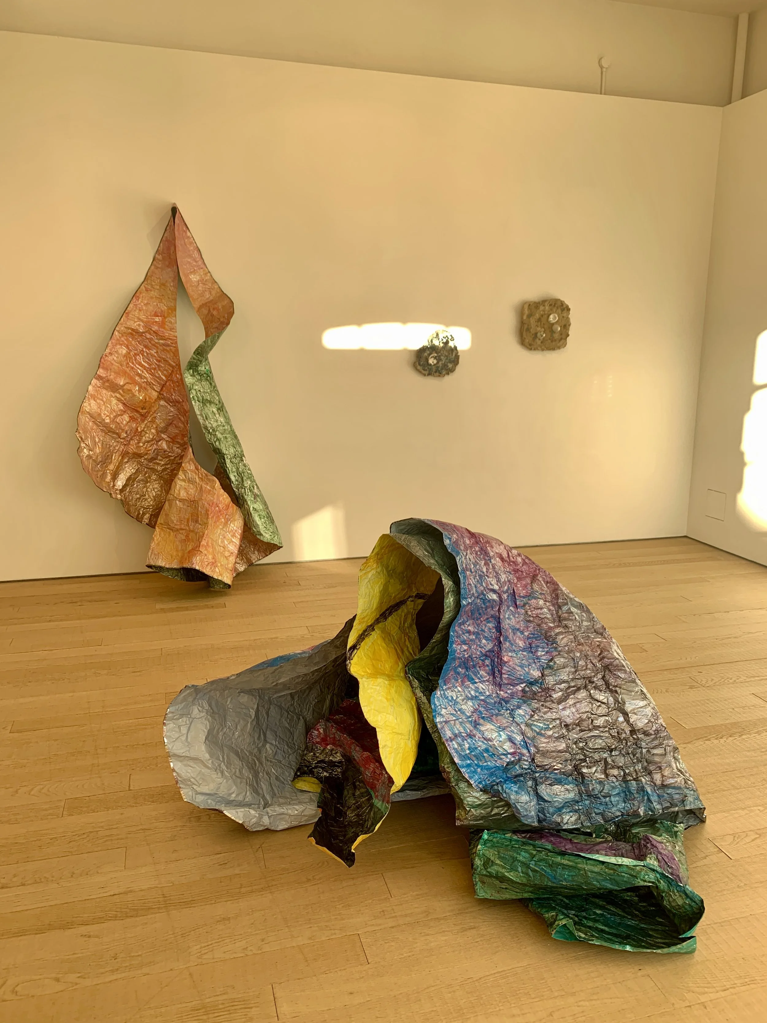
The sculptural works by Sarah Ryder form interesting lo-fi looking forms. Initially this central work looked like a person huddling in a duvet. Layers of thin worked surfaces make camp in the space. The colours are interesting & the application of them on the surface of the foil is something I havnt’t seen before.
Gallery 2 where this work is exhibited often gets a wonderful burst of sunlight towards the end of the day, this brings new life to this work where the surface dances brightly in the intense golden light. Its exciting to be able to get close to work like this, crouching to see inside, learning there is no support structure. Its almost fragile but sits in the space confident & unmoving.
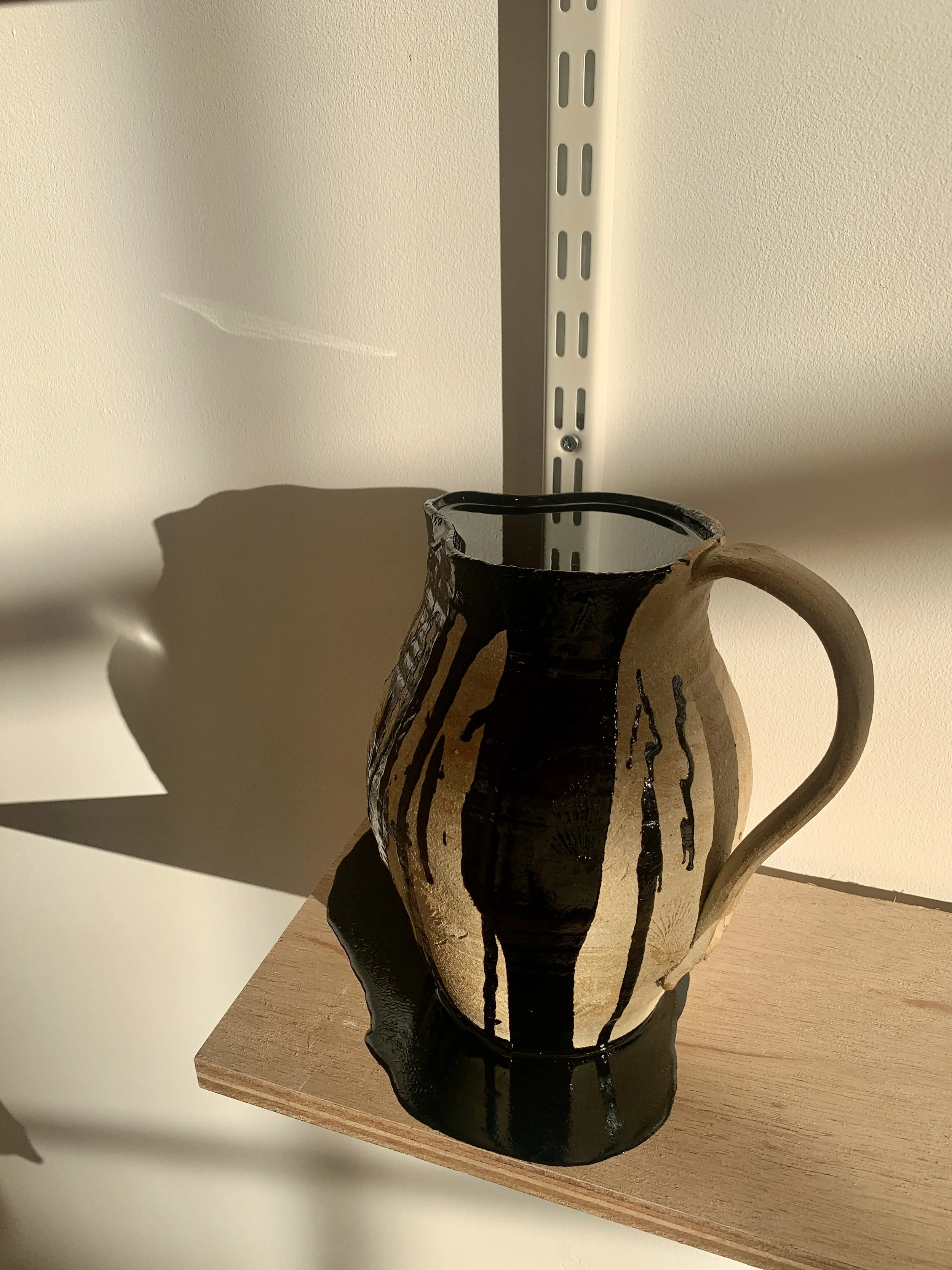
Lastly Phil Root’s Shallows, A stoneware vessel filled with thick, shiny black bitumen. Although this work is rooted in a serious theme of relationships to the earth & our everyday surrounding, for me the smell & potential change of this work is what I respond to. The stoneware jug is filled to the top & there is evidence of spillage on the side of the jug, yet no movement occurs in the liquid. At any moment a droplet of bitumen that has run down the jug & onto the shelf could drip, but I don’t think it will. The pool of shiny black liquid around the base could spill over the edge, but it won’t. As a kid, if you’ve ever played in the street in the summer & found a re-surfaced pavement, you’ll remember the sticky tar would soften enough that you could poke your finger into it making your fingers sticky. But it was never soft enough to run. This bitumen has that same property, it has every potential to leak or dribble, but is just too thick to ever do so in a hurry. I like that.
As always you must go & see a show for yourself, spend time with the work, make your own mind up about what everything means. For me some of the work changed after I looked into it. I understood processes & practices differently. Information about the show is here.
**Post disclaimer. I battled with wanting to write about the paintings at the top of this post due to one of the materials used to make them, Rabbit skin glue. Having never knowingly come across this material before, I wonder whether its properties contribute to what I enjoy about the work. This does stir an emotion in me, as the use of animal products for human consumption in any form is really something I try to avoid. Mostly because it makes me sad. Of course it is very difficult to avoid the use of animal products in life & I fall short of this myself by owning leather shoes. But knowing of its presence does make me consider its use & whether there is an alternative.
The point for me is, having to process the use of an animal product in something I consume. In this case cultural consumption. It’s important to gain an understanding of its use & become aware of it. Knowing more about it allows me to identify it in the future & choose an alternative for my own personal use.
Much like the gelatin silver process used in photography, rabbit skin glue has a long history of use & has been used extensively in art making. Thus making it hard to avoid the cultural consumption of animal products when viewing art. Its likely that many of the fine art paintings in art galleries will have used such an ingredient on the canvas or in its photography.
This part of the post is purely a personal & emotional reaction to a material used by an artist. Which has ultimatley acted in the way that art should - by provoking an emotional reaction. Although this has arisen in a way that was unexpected, it has perfectly made a point about what makes art special.
That is the surprise of what will be encountered in the gallery.