British Art Show 9. Plymouth
British art show 9 (BAS9) landed in Plymouth this autumn & in its final week I finally got there. Although I spent a good five hours looking around the various galleries, somehow it still felt rushed & even though I spent time in front of some of lots of work, I don't know if I took a lot of it in. This could be reflected in the fact that I didn't take many photos - just a few quick snapshots of things that caught my eye or gave me inspiration. This means some of the best work unfortunately will go and documented here, additionally there were quite a number of video works which are too difficult to capture.
Just as the Box was closing at about 16:57 I've rushed to the shop to buy the catalogue in order to compensate myself for what I may have missed. This was a really useful purchase as this year at the British art show it was decided that different artists would show at each of host cities, bringing some locality into each exhibition. So at least this way, I will be able to read about each of the artists that I hadn't seen and learn more about the ones that I had.
One thing I struggle to do at exhibitions is read written information. I prefer to head straight to the physical work. I had attended BAS9 with a friend who is fantastic at filling in the gaps that I miss because she does read the information. Any of the key information that I miss she gracefully fills me in on, alerting me to some finer points. On the whole it doesn't bother me as ignorance can be bliss, & if the work is engaging then that surpasses written context for me. Many times we've been to exhibitions & I've been so sure that I've not liked a work until my friend talks me round by explaining some of the things that I've missed & all of a sudden I love it.
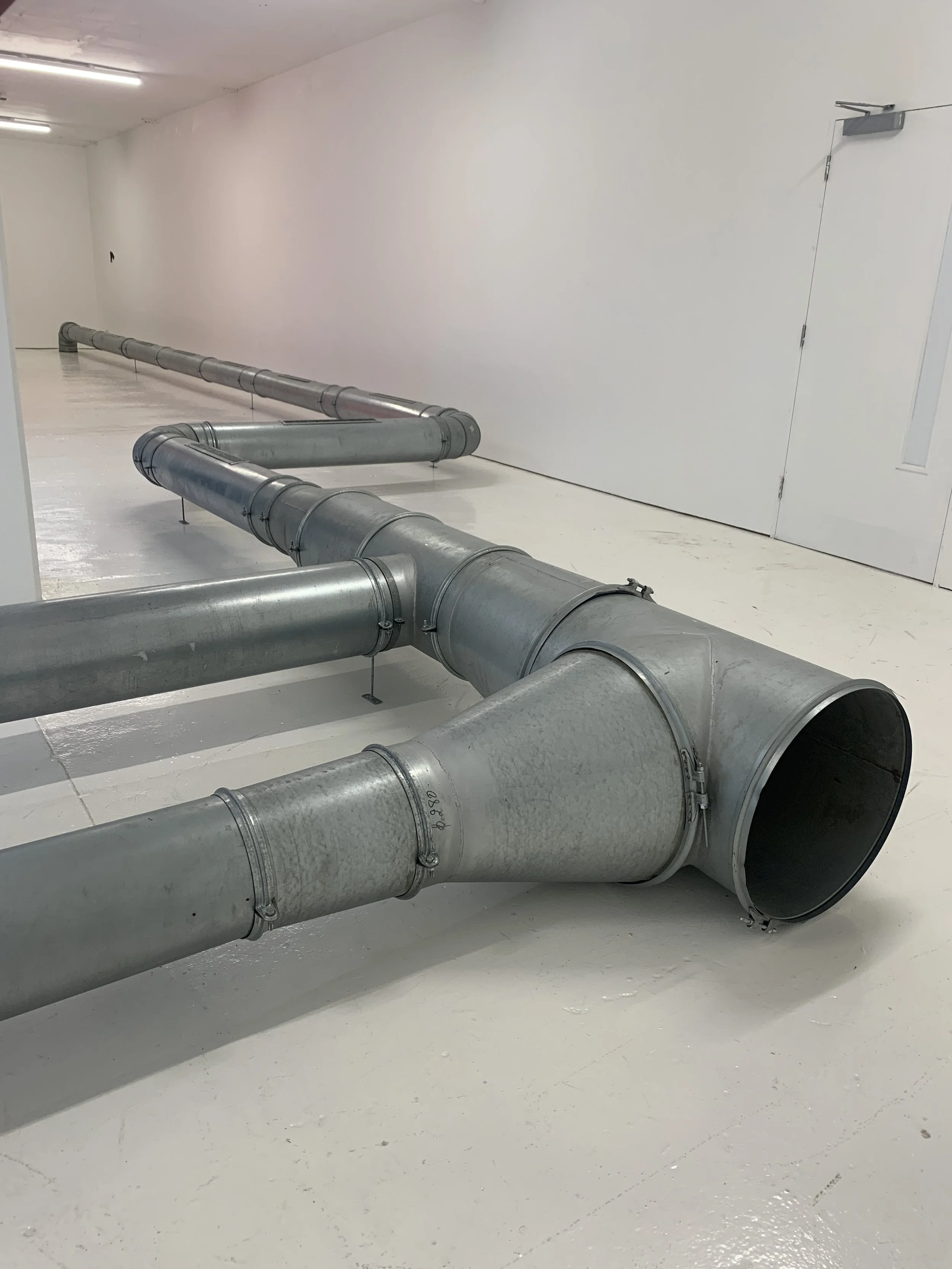
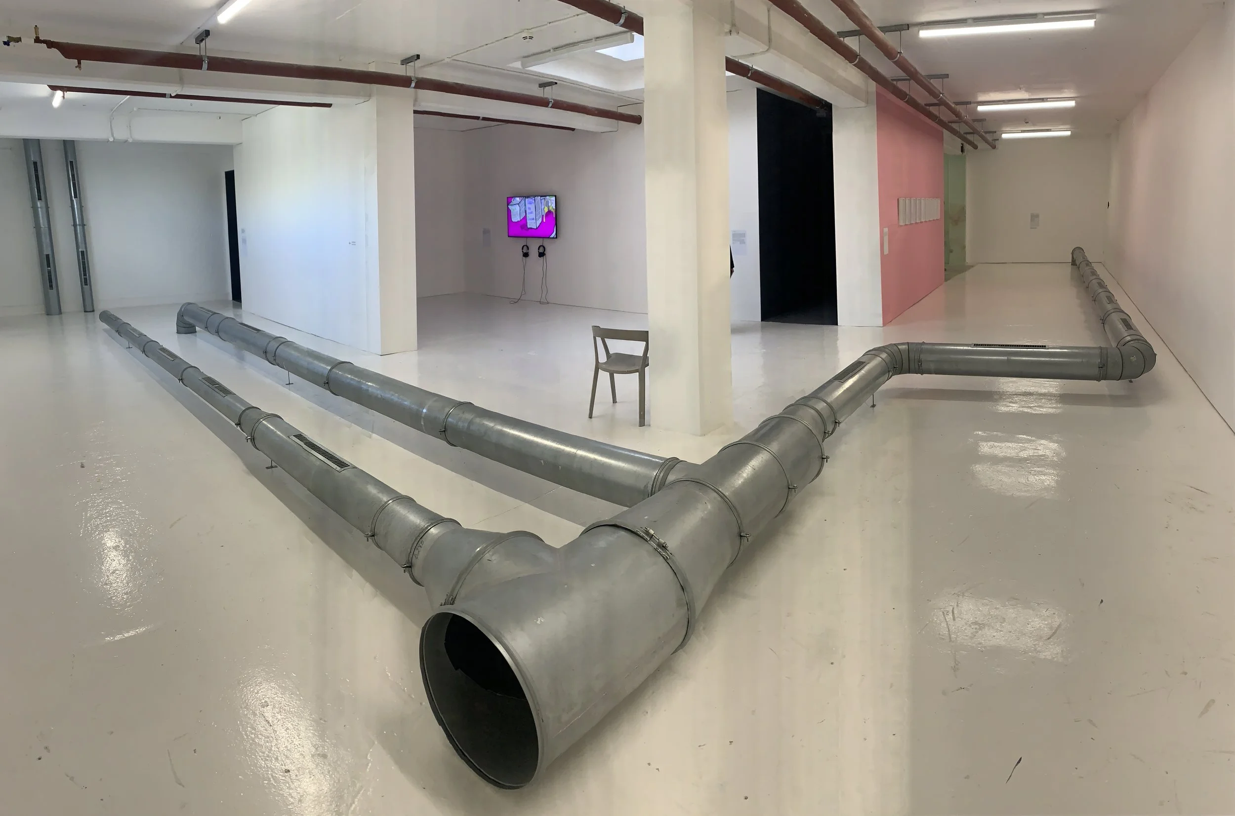
At BAS9 in Plymouth each venue maintained a different identity within the curation of the work. The first space we visited was KARST. The space was dominated by ‘Violet 2’, 2018 by Ghislaine Leung who had created this work from the redundant ventilation system that was being removed from a bar in Belgium. The script for this work ‘Insists that all this equipment must be used in the largest possible spatial formation ‘while keeping it all interconnected’, with smaller formations made from what remains,…’. It is safe to say this was achieved. The ducts cover the length & width of the entire exhibition space. At low level they begin to direct how you can move in the space.
In context of previous work shown at KARST this adds to the bold narrative on how they often use the space, by putting something large in it or transforming the layout. This work is of an industrial nature & Leung’s work often highlights the inner workings of an exhibition space, such as the ducting or electrical sockets. KARST embraces its industrial space & often capitalises on this through its curation. In 2019 I was even able to do this with my own work during my MA studies in Plymouth. Using the spacial features to enhance the industrial nature of my work.
Within the rest of the space there were a few other installations & video works.

Across town at the University of Plymouth in the Levinsky gallery the mood changed. There was more colour & texture, the large windows onto the city street were used to bring light through Abigail Reynolds work ‘When Words are Forgotten’ 2018. A composition of coloured & textured glass on a metal frame. This large collage is reminiscent of Abigail’s cut paper works. Here the focus is on the material textures & was spurred on by her imagining of vanished libraries from the Silk Road between China & Italy. A parallel between the fragility of books & glass is drawn.
This work is complimented by the nearby hanging of Katie Schwab. ‘Strength Study’ 2021, where she explores domestic textiles, Civic architecture & early- mid 20th century design & craft by women. The colours are a reflection of a stained glass window in a Dutch church & the shapes/formation of the fabric taking cues from structural textile restoration & the structural restoration of the same church. The 2 works are in dialogue here enlivening the space with form & colour.


‘Undo things done’, by Sean Edwards punctuates one end of the gallery. As mentioned at the top of this post, I don’t really respond to text in art, but the typeface, colour & scale of this work speak to me. Its placement on the wall & execution are satisfying to me. I had more of a physical appreciation of this work than a literary one.

Moving swiftly across to MIRROR, a small gallery in the University of the arts Plymouth (formally Plymouth college of arts) a wonderful object & sound installation fills the entire space. ‘Household Gods’, 2019 by Oliver Beer. This work contains vessel objects from family member’s homes that are displayed on a variety of plinths. Many of the objects have a microphone placed in the opening & some of the plinths have speakers placed on them. The resulting sound in the space replicates the sound of an orchestra tuning up. Something I couldn’t work out is whether the visitors could influence the sound. After making some noise near a microphone I tried to hear if that sound added to the space but it was difficult to tell. It seemed that the soundtrack was unaffected.
For me the joy of this work was the curation. It played with the conventions of sculptural display & questioned the authenticity of object & exhibition. Furthermore the intrusion of technology in the openings of some of the objects & lack of effort to hide the wiring was exciting. Not only were we able to have a good look at some personal domestic collections, we saw behind the scenes of how this artwork operated. The performative aspect even went as far as the viewers having to remove their shoes on entry or putting on shoe socks to help preserve the space. This was one further element adding to the tropes of museum display.
It was fun to be in this space, a totally enveloping environment with only the work. However after a while, much like the objects on display, the sound got inside me & became too much to endure. So it was time to leave.


Finally (as far as my documentation goes) we headed to the box’s St Lukes gallery. Here the volumes of the space were exploited with several sprawling & lofty works.
I was initially drawn to this work by Oscar Murillo because of its form. It is draped, piled & folded on the walls & floor. A way of showing work that I have also been exploring. In essence the dark heavy material used by Murillo is the antithesis of my own material exploration - which explores ephemerality & translucency - but in the same manner of display. The suggestion in Murillo’s work of too much material to work with, issues surrounding storing something large or a body of work in flux are interesting notions & are defying features in my own practice. The piles of excess material is present as neatly stacked forms & as run off from the wall pieces.


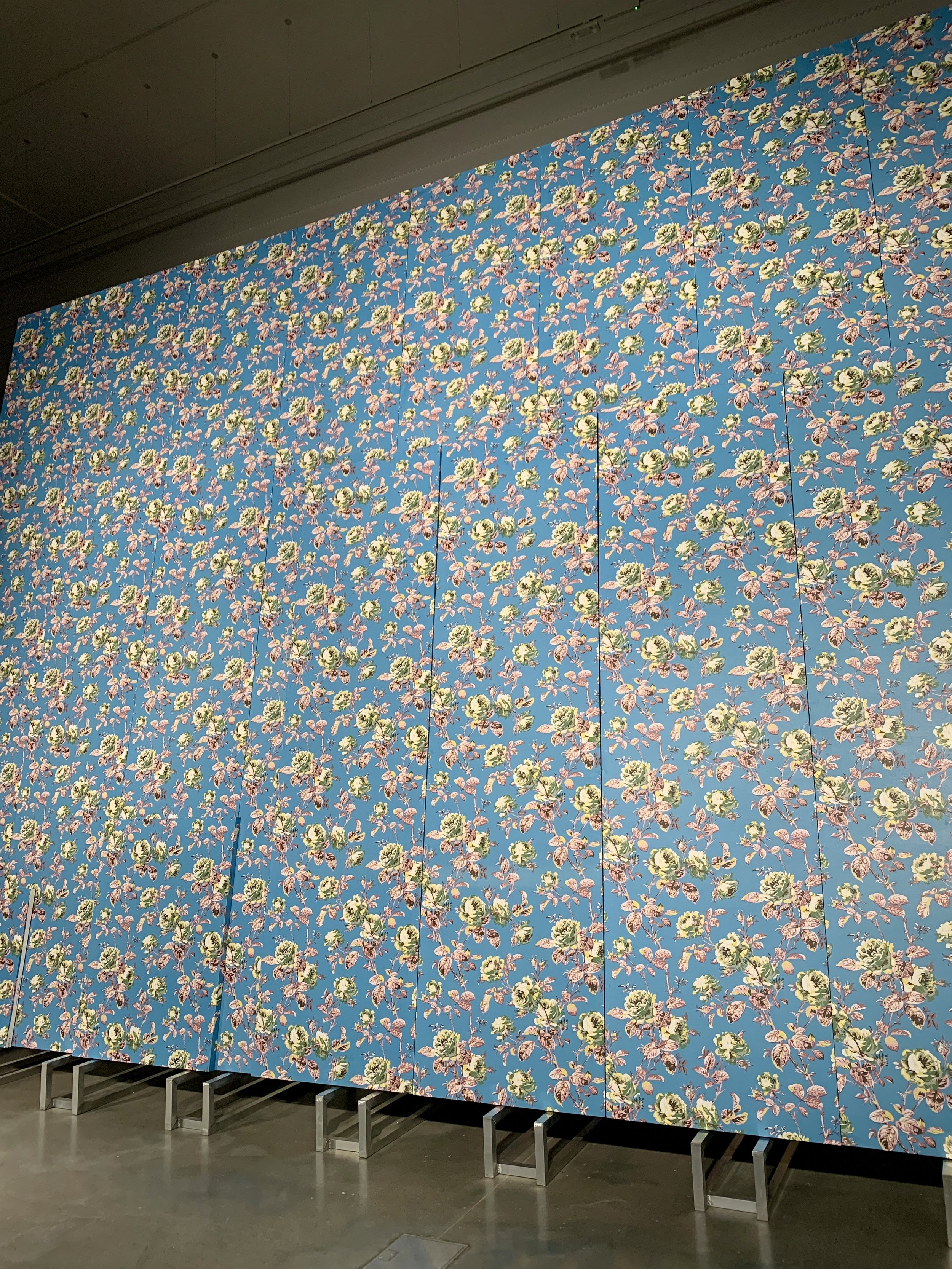
Than Hussein Clark’s work is particularly striking due to its scale. The enormous floral prints originally designed by Rose Cumming shoots up into the space. There is a theatrical feeling to this work in part from its scale, the spotlights illuminating the piece & the ability for viewers to pass behind the work where the structure holing the whole work in place is on full view. Than’s work uncovers themes of migration & queer histories, a point I learned after seeing the work when doing a little bit of research.
An element that Hussein Clark also likes to explore is the heritage or craft ship used in the making of the work. To achieve such a high standard of finish, what is incorporated in the making of the work is the relationship with the people who own the design & produce it. This brings in a collaboration & authenticity to the story being told through the exhibition. This element is tangible in the space as the fabrication of the printed fabric work is impeccable. It is shown in a way that makes it as important as the rest of the work.

After seeing the work at St Lukes we went into the BOX & saw the work there. I did not take any photos here, but I have to mention that 2 of my favourite works were in this gallery & one of the most hard-hitting pieces that speaks to the theme of a more realistic representation of todays British Artists.
I was blown away by the portrait paintings of Caroline Walker depicting women who were seeking asylum in the UK. The paintings staged in the temporary spaces that the woman lived in while they went through the asylum process. Only one of the women shown was ever given asylum.
I also enjoyed slowing down to the highly stylised film ‘A Dream of Wholenessin Parts’ (2021) by Victoria Sin. It was a window in to their own way of self identification through drag & traditional Chinese imagery. The colours, makeup, facial expression & body language told a story of their own which speak volumes to the queer community.
Finally, the video & surrounding installation by Alberta Whittle was a powerful gut punch reminder of colonial histories, in Whittle’s case with the Caribbean. This work actively confronts us with todays real truths surrounding colonialism & migration with lived experiences that can give more truth than anything else.
These 3 works are an exciting exploration in British art & show the value of creative work in educating, inspiring, illuminating & challenging what we know about todays world.